
WEB USABILITY & ACCESSIBILITY
* Analyzing web usability and accessibility.
Useful Website: w3schools.com
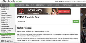
This w3schools.com site is useful because of WYSWYG.
I believe their objectives are:
(1) To become a practical web development/design tutorial website
(2) To reach a targeted page within 3 clicks
[Solutions]
(1) Providing an example page where a user can actually type code and execute online so that she/he can see the output from her/his code.
(2) Demonstrating an excellent navigation menues and shortcuts so that a site visitor can reach her/his targeting page not over 3 clicks.
Website Efficiently Uses Colour: FCV Technologies Ltd.

These three coloured boxes are eye-catchy, and it is easy for site visitors to grasp their essential ideas of "How we do it" here.
[Application]
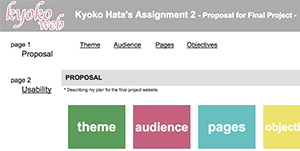
In this Assignment 2 website, I am using the colours of those boxes and the text.
| color | a:link, a:visited |
a:hover, a:active |
|---|---|---|
| #212121 | #212121 | #e12339 |
Layout: BCIT.CA
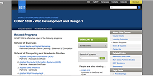
The BCIT site has lots of functionalities and the site is well laid out to its user experience.
For example, if you visit a page for a program, the page shows you all of options you may want to know, such as eligible courses for you to earn a credential, posssible careers after completing the program, etc.
In addition, what I like about this site is to give me an opportunity to explore related programs through the course you choose.
This permits a student to find more suitable program for her/his career.
10 Things Web Developer Should Avoid.

There are so many DON'Ts for a web developer NOT to do. Here are 10 things I picked up NOT to do as a web developer.
- Can't go back to the home page within 1 click.
- Need over 3-Click to reach the page a user wants to visit.
- Menu moves around in each page. (Not located on the same place.)
- Takes more than 4 seconds to load a page.
- Uses more than 3 font-faces in a page.
- Doesn't use white space efficiently (too much white space, or to little).
- Doesn't use properly proposioned graphics.
- A user doesn't know where the page she/he is looking at is located in the website. (Should use a breadcrumb menu.)
- Doesn't use a graphic tool such as Photoshop to make a graphic small pixel-wise, but instead, uses "width" and "height" properties.
- Doesn't consider the contents seriously, but just designs a page layout without taking account of the contents' structure.